5 Kibana Visualizations To Spice Up Your Dashboard
Dashboards need to render data in the best way. Here are 5 visualizations to build an amazing dashboard and gain new insight into your system.
Join the DZone community and get the full member experience.
Join For FreeIf you work in any way that is adjacent to data, insight, and analytics, there’s a good chance you will at least have heard of Kibana. If you haven’t then there’s no better time to be jumping on the bandwagon.
An open-source app, Kibana caters perfectly to any enterprise that needs to incorporate data discovery, navigation, and visualization. So long is the list of features and benefits that it’s impossible to cover them all in a single article. Tools like Kibana Lens showcase this beautifully.
Despite the ease of use that comes with a single UI interface, Kibana is by no means a tool that doesn’t cater to developers. As Kibana is open source, there is a limitless supply of third party features and code on GitHub. As standard Kibana includes a development console, search profiler, and debugger (Grok).
All of this sounds great, right? But great doesn’t always mean useful. If you’re curious about what exactly Kibana can do for your data I have compiled a list of five of the more common visualizations offered (and a few examples of uses).
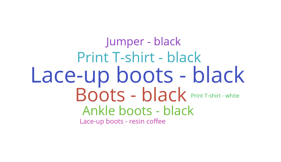
Tag Cloud
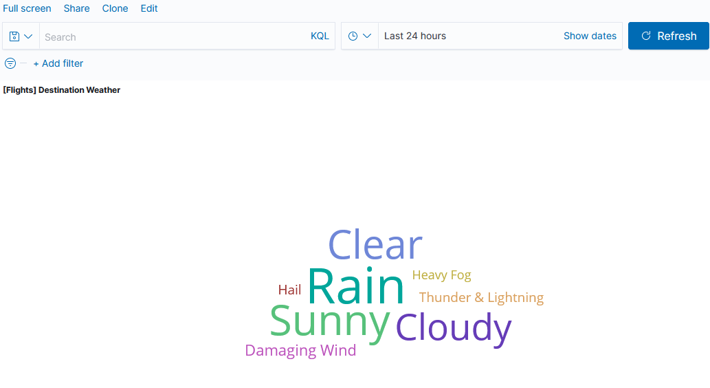
If you’re analyzing any kind of text data, a tag cloud is a great addition to your dashboard. As expected, Kibana makes this process intuitive and simple. This also highlights an area in which Kibana holds advantage over other offerings like Grafana- text based querying as a feature.
In a nutshell, a Tag Cloud is a stylish method of representing the frequency of tags/words within content. Whilst usually used for speeches, websites, and articles, Kibana’s ability to create tag clouds from databases has some incredibly useful applications. One of the most interesting practical uses I’ve seen is in a security dashboard which contained a tag cloud of the most common passwords used in unauthorized access attempts.
Insight is gleaned from Tag Clouds by font size and/or color. The bigger the font, the more common the instance. Kibana offers several metric aggregations to tweak the final visualization. Instances can have weight added to them based on other information attached to each entry.
Tag Clouds are an incredibly powerful way to render out a great deal of data in a simple, easy to understand space. The more information you have, the better. The above tag cloud is driven by all of this data:
Be Careful of One Thing...
When generating Tag Clouds in Kibana, the key gotcha to remember is that fielddata is disabled on text fields by default. When loading text fields (especially high cardinality ones) the fielddata can eat your heap space almost completely.
Disabling fielddata as the default prevents accidental over-consumption of system memory. The most common fix I’ve seen for problems generating Tag Clouds is to enable fielddata on your text field, which is as simple as using the PUT mapping API
Heatmap
This is my personal favorite, and also a relatively recent addition to Kibana’s arsenal (added by Elastic in 2017).
In short, with a Heatmap single bucket values can be represented as colors. Here’s the catch that makes Kibana Heatmaps so interesting, though. In other visualizations, a color would represent a single metric. One color for logged error messages/help request tickets, another for tasks ticked as ‘complete’.
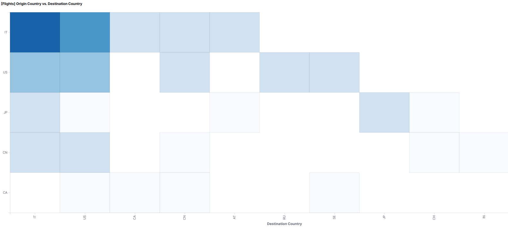
With a Heatmap visualization colors don’t represent single metrics. They represent the total aggregation value of a bucket. What’s more, by measuring and presenting data in hourly timestamps, Heatmaps create intuitive and easy-to-understand charts that are unrivaled if you’re presenting anything changes over time.
This makes them incredibly useful for measuring outputs like latency/response time- a Heatmap gives you a clear picture of distribution modes, outliers, and other details which other visualizations simply can’t match.
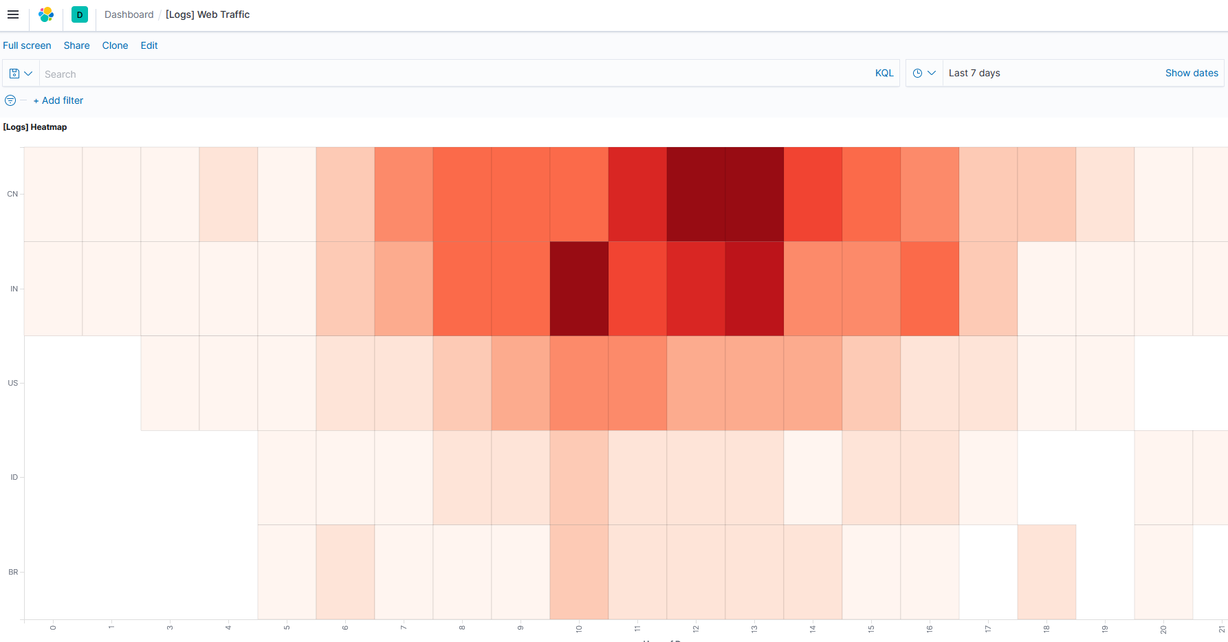
Heatmap measuring the origin of web traffic for a site, showing the country of origin against the hours of the day.
If you’re putting together a Heatmap use histogram instead of terms aggregation when use dates or times. This enables all buckets to be visualized. Kibana can sometimes get confused otherwise. As an example, a common problem when measuring counts of instances using the day on the X axis and hour on the Y is that Kibana will switch the order around. Using the Histogram aggregation should fix it.
Pie Chart
Ah, the trusty pie chart, staple visualization of choice for high school math students and circle enthusiasts the world over.
There is a reason that Pie Charts continue to be one of the most commonly occurring methods of representing data. Anybody can understand them, they are visually incredibly clear, and they’re easy to put together.
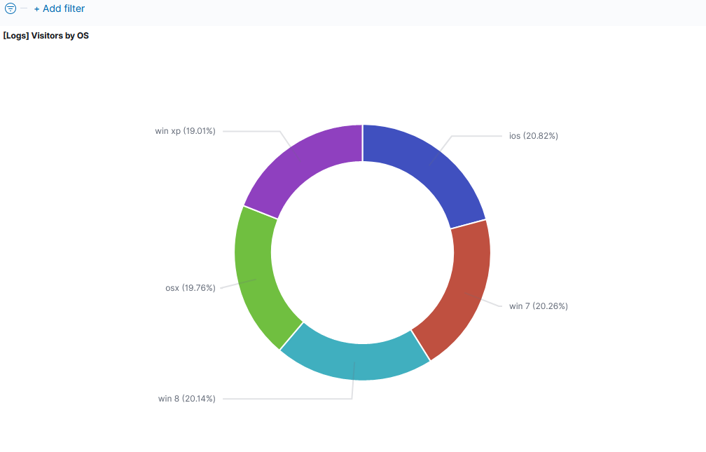
Naturally, Kibana’s Pie Chart visualization offers a host of customization options and interactive features. For example, you can include functionality to auto-filter based on slice criteria with a single button click on a dashboard. You can also generate multi-ringed charts wherein each ring visualizes a different bucket.
Pie Charts are relatively simple. As such, so long as you know your way around the UI and have a good head for analytics, you shouldn’t run into too many issues. A common rookie mistake is confusion of the ‘Split Slice’ and ‘Split Chart’ features. The fix is simple- undo and remember which does which!
Sankey Diagram
If you’re monitoring network traffic, or anything which needs flow and destination monitored, a Sankey Diagram is a must-have for your dashboard.
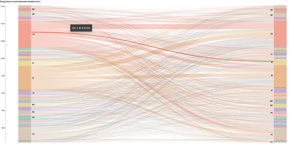
The Kibana open source community has created a treasure trove of features, code, and support for Sankey Diagrams. They are honestly one of the most useful visualizations available if you need to monitor anything remotely to do with a network.
The best way to think of a Sankey is two stacks of nodes, source and destination. These are represented vertically either side, with a mess of aesthetically pleasing lines of varying thickness running between each.
I’m not joking when I say they’re aesthetically pleasing either. I know visuals aren’t ever really a consideration for an efficient dashboard, but if you ever need to wow some non-technical stakeholders a Sankey will do the trick. Seriously, look up some complex Sankey Diagrams when you get the time. Mount one on a canvas and take it to a gallery- I guarantee a gullible art connoisseur will pay top dollar for it.
The premise of the Sankey is incredibly simple, too. Thicker, more opaque line = more traffic/great flow. Easy.
Unlike Pie Charts, Sankey Diagrams are a little more complex to put together. There are a lot of pitfalls to watch out for- skills with Vega (Kibana’s coding language) will definitely help. An example of this is support for making your Sankey Diagram multi-level. This is a complex task, and one that doesn’t seem to be solvable by tweaking settings in the Kibana UI. Fortunately, there are many forum posts out there from keen Kibana users who have come up with some very intuitive solutions.
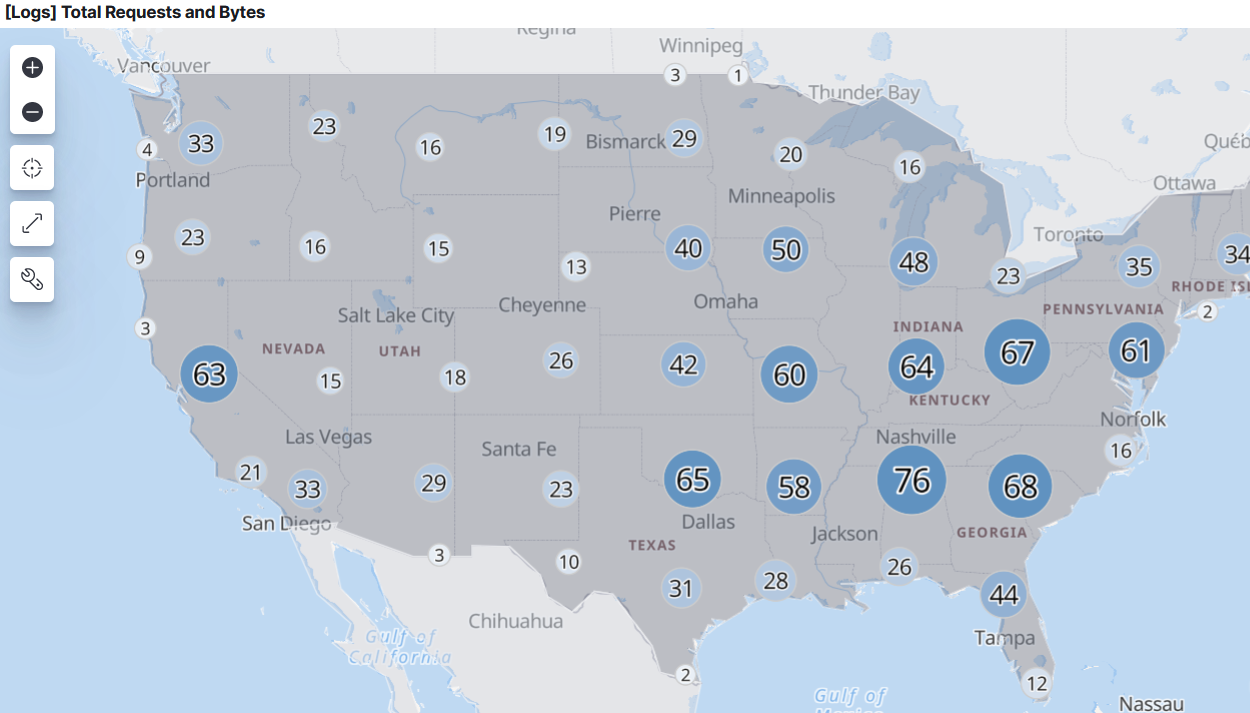
Maps
When I was hiring for analytics experts with mapping experience, my non-technically-minded friends were confused. ‘Maps,’ they’d say, ‘what do maps have to do with graphs and computers and numbers and that?!’
Ok, I’ll admit, I hugely over exaggerated the level of stupidity. Call it artistic licence. The point still stands though- maps aren’t what people usually think of when you talk about big data.
Just because they’re not often considered doesn’t mean they’re not often used. The reason they’re used often is that they are (like most things used a lot) incredibly useful. Seems a no brainer, right?
If you’re monitoring any kind of global (or indeed, national) scale system or network, live mapping functionality on your dashboard is an absolute necessity.
There are a bunch of features and open source code available for Kibana that make incorporating Maps into a dashboard a breeze. Not to mention the almost limitless supply of customization options.
Maps are the key ingredient in any setup that successfully monitors international networks, systems, or enterprises. If you want to create maps with more than one layer/indices, embed said maps in live dashboards, and focus only only the data those maps contain that is useful in the present moment, Kibana is the way to go.
Here’s a thing to remember with Maps- map based analytics is a rare/complex enough skill that it’s often requested specifically by companies when they hire (on top of any apps/software/models they may be using). The key point there is that it is tricky. There are a lot of errors and gotchas that will come up in the process unless you know what you’re doing.
The most common of these are to do with features or tiles not displaying correctly, or indexes disappearing when a new layer is added. Fortunately, there’s nothing that doesn’t have a quick fix available and dozens of resources to do so courtesy of data engineers who have come across the same problems.
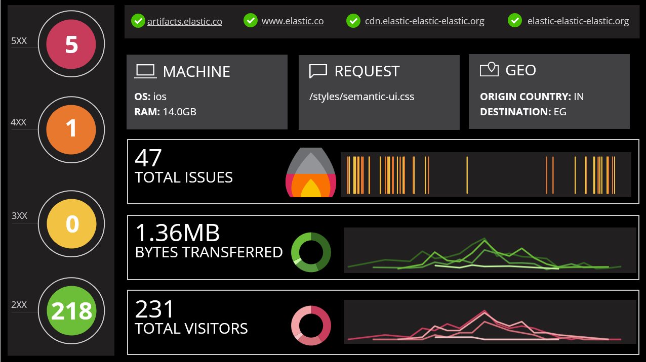
A fully fledged Kibana dashboard for monitoring web traffic/issues.
As you can see, there’s an almost infinite variation of ways to visualize your data using Kibana. This list barely scratches the surface. However, if you’ve been deliberating which tool is best for the job, you can’t get much more versatile than Kibana if that job is building a dashboard.
Opinions expressed by DZone contributors are their own.
Comments