DZone
Thanks for visiting DZone today,
Edit Profile
  • Manage Email Subscriptions
  • How to Post to DZone
  • Article Submission Guidelines
Sign Out View Profile
  • Post an Article
  • Manage My Drafts
Over 2 million developers have joined DZone.
Log In / Join
Refcards Trend Reports
Events Video Library
Refcards
Trend Reports

Events

View Events Video Library

Zones

Culture and Methodologies Agile Career Development Methodologies Team Management
Data Engineering AI/ML Big Data Data Databases IoT
Software Design and Architecture Cloud Architecture Containers Integration Microservices Performance Security
Coding Frameworks Java JavaScript Languages Tools
Testing, Deployment, and Maintenance Deployment DevOps and CI/CD Maintenance Monitoring and Observability Testing, Tools, and Frameworks
Culture and Methodologies
Agile Career Development Methodologies Team Management
Data Engineering
AI/ML Big Data Data Databases IoT
Software Design and Architecture
Cloud Architecture Containers Integration Microservices Performance Security
Coding
Frameworks Java JavaScript Languages Tools
Testing, Deployment, and Maintenance
Deployment DevOps and CI/CD Maintenance Monitoring and Observability Testing, Tools, and Frameworks

Low-Code Development: Leverage low and no code to streamline your workflow so that you can focus on higher priorities.

DZone Security Research: Tell us your top security strategies in 2024, influence our research, and enter for a chance to win $!

Launch your software development career: Dive head first into the SDLC and learn how to build high-quality software and teams.

Open Source Migration Practices and Patterns: Explore key traits of migrating open-source software and its impact on software development.

  1. DZone
  2. Refcards
  3. Getting Started with Java GUI Development
refcard cover
Refcard #095

Getting Started with Java GUI Development

Building a Swing Application

To develop standalone Java apps, developers can use either Java Swing or SWT. This Refcard will help users get started with either.

Free PDF for Easy Reference
refcard cover

Written By

author avatar James Sugrue
Chief Technology Officer, Over-C
Table of Contents
► About Java GUI Development ► Java Swing - A History ► Core Packages ► The Anatomy of a Swing Application ► Swing Components - Containers ► Other Swing Containers ► Swing Components - Basic Controls ► Core Layout Managers ► Event Handling ► Threading Issues in Swing ► Eclipse Standard Widget Tookit - A History ► Core Packages ► The Anatomy of an SWT Application ► SWT Components - Containers ► SWT Components - Basic Controls ► Core Layout Managers ► Event Handling ► Threading in SWT
Section 1

About Java GUI Development

For standalone Java desktop application, developers have two main options. You can use Java Swing, built into the JDK, or you can use the Standard Widget Toolkit (SWT) from Eclipse. Both approaches share some commonality, but each has its own advantages and methods. This DZone Refcard provides a reference on how to use both technologies; the first half of the Refcard will cover Swing, with SWT forming the second half.

Section 2

Java Swing - A History

Before Swing, the only option that Java GUI developers had was to use AWT (Abstract Widget Toolkit). However, because of limitations in AWT, such as the number of components and portability issues, Sun introduced Swing. Swing is built on AWT components, and also uses its event model. While AWT provides heavyweight components, Swing provides lightweight components and adds advanced controls such as tables because it does not require the use of native resources within the operating system.

Section 3

Core Packages

Package Purpose
javax.swing Provides a set of “lightweight” (all-Java language) components that, to the maximum degree possible, work the same on all platforms.
javax.swing.border Provides classes and interface for drawing specialized borders around a Swing component.
javax.swing.colorchooser Contains classes and interfaces used by the JColorChooser component.
avax.swing.event Provides for events fired by Swing components.
javax.swing.filechooser Contains classes and interfaces used by the JFileChooser component.
javax.swing.plaf.basic Provides user interface objects built according to the Basic look and feel.
javax.swing.plaf.metal Provides user interface objects built according to the Java look and feel (once codenamed Metal), which is the default look and feel.
javax.swing.plaf.multi Provides user interface objects that combine two or more look and feels.
javax.swing.plaf.synth Synth is a skinnable look and feel in which all painting is delegated.
javax.swing.table Provides classes and interfaces for dealing with javax.swing.JTable.
javax.swing.text Provides classes and interfaces that deal with editable and noneditable text components.
javax.swing.text.html Provides the class HTMLEditorKit and supporting classes for creating HTML text editors.
javax.swing.text.html.parser Provides the default HTML parser, along with support classes.
javax.swing.text.rtf Provides a class (RTFEditorKit) for creating Rich-Text-Format text editors.
javax.swing.tree Provides classes and interfaces for dealing with javax.swing.JTree.
javax.swing.undo Allows developers to provide support for undo/redo in applications such as text editors.

Hot Tip

Model View Controller

Swing relies a lot on the MVC structure, where a component consists of a data model, a visual representation and a controller for event handling.
Section 4

The Anatomy of a Swing Application

All Swing components are derived from JComponent, which deals with the pluggable look & feel, keystroke handling, action object, borders and accessibility.

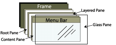
A typical Swing application will consist of a main window, with a menu-bar, toolbar and contents. The main shell for the application is represented as a JFrame. Within the JFrame, an instance of JRootPane acts as a container for all other components in the frame.

The structure of a JFrame

Figure 1: The structure of a JFrame

The root pane has four parts:

The glass pane

The glass pane is hidden by default. If it is made visible, then it’s like a sheet of glass over all the other parts of the root pane. It’s completely transparent unless you implement the glass pane’s paintComponent method so that it does something, and it can intercept input events for the root pane.

The layered pane

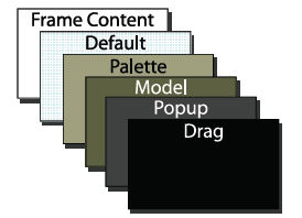
The layered pane positions its contents, which consist of the content pane and the optional menu bar. Can also hold other components in a specified Z order, as illustrated in Figure 2.

The content pane

The content pane is the container of the root pane’s visible components, excluding the menu bar.

The optional menu bar

If the container has a menu bar, you generally use the container’s setJMenuBar method to put the menu bar in the appropriate place.

Layer order in layered pane

Figure 2: Layer order in layered pane

Section 5

Swing Components - Containers

javax.swing.JFrame

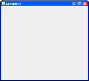
JFrame is the main window component of any Swing application. To create an application window, you just need to create a class that extends JFrame.


public class SwingApp extends JFrame
{
  public SwingApp(String title)
  {
    super(title);
    setSize(400, 400);
   }
}

A Swing JFrame

Figure 3: A Swing JFrame

javax.swing.JApplet

JApplet allows the addition of menus and toolbars to applets hosted in a browser. Since Java 6 Update 10, applets can also be dragged outside of the browser to run on the desktop.

Construction code for applets go into the init() method, rather than the applets constructor.


public class SwingApplet extends JApplet {
public SwingApplet()
{}
public void init()
{
setSize(100, 100);
}
}
Section 6

Other Swing Containers

Container Purpose
javax.swing.JDialog Creates a custom dialog, either modal or modeless. JOptionPane can be used to create standard dialogs.
javax.swing.JPanel JPanel is a generic lightweight container used to group components together and add to other windows such as JFrames.
javax.swing.JSrollPane Provides a scrollable view of another lightweight component. The JScrollPane provides a viewport with optional scrollbars at veritical and horizontal positions.
javax.swing.JSplitPane Displays two components either side by side (JSplitPane.HORIZONTAL_SPLIT), or one on top of the other (JSplitPane.VERTICAL_SPLIT).
javax.swing.JInteralFrame Provides many of the features of a native frame, including dragging, closing, becoming an icon, resizing, title display, and support for a menu bar, allowing Swing applications to take on a multiple document interface.
javax.swing.JLayeredFrame Adds depth to a Swing container, allowing components to overlap each other when needed. For convenience, JLayeredPane divides the depth-range into several different layers. Layers available include DEFAULT_LAYER, PALETTE_LAYER, MODAL_LAYER, POPUP_LAYER, DRAG_LAYER.
Section 7

Swing Components - Basic Controls

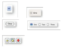
Components Appearance (for Windows XP default Look & Feel)
javax.swing.JButton Button
javax.swing.JCheckBox Check Box
javax.swing.JComboBox Combo Box
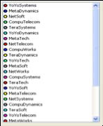
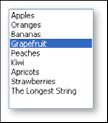
javax.swing.JList List
javax.swing.JMenu Menu
javax.swing.JRadioButton Radio Button
javax.swing.JSlider Slider
javax.swing.JSpinner Spinner
javax.swing.JTextField Text Field
javax.swing.JToolbar Toolbar
javax.swing.JTabbedPane Tabbed Pane
javax.swing.JPasswordField Password Field
javax.swing.JColorChooser Color Chooser
javax.swing.JEditorPane Editor Pane
javax.swing.JTextPane Text Pane
javax.swing.JFileChooser File Chooser
javax.swing.JTable Table
javax.swing.JTextArea Text Area
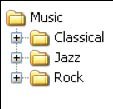
javax.swing.JTree Tree

Hot Tip

Containment Each component can only be contained once. If you add a component to another container, after adding it to a different one previously, it will be removed from the previous container, and only added to the last one.
Section 8

Core Layout Managers

All layout managers implement one of two interfaces: java. awt.LayoutManager or its subclass, java.awt.LayoutManager2. LayoutManager provides methods that give a straight-forward, organized means of managing component positions and sizes in a container. LayoutManager2 enhances this by adding methods intended to aid in managing component positions and sizes using constraints-based objects. Constraints-based objects store position and sizing information about one component and implementations of LayoutManager2 normally store one constraints-based object per component.

java.awt.FlowLayout

A flow layout arranges components in a directional flow one after the other, moving onto a new line when no more components fit on the current line. Direction is determined by the container’s componentOrientation property and may be one of two values: ComponentOrientation.LEFT_TO_RIGHT or ComponentOrientation.RIGHT_TO_LEFT

Flow layout is the default layout manager for AWT and
Swing components.

java.awt.GridLayout

GridLayout lays out a container’s components in a rectangular grid. The container is divided into equal-sized rectangles, and one component is placed in each rectangle. Typically, a GridLayout is constructed by specifying the number of rows and columns.

java.awt.BorderLayout

BorderLayout lays out the components in five regions: NORTH, SOUTH, EAST, WEST and CENTER. As each component is added to a container with a border layout, the location is specified similar to: container.add(component, BorderLayout.CENTER);

java.awt.CardLayout

CardLayout acts as an organisation of stacked components on a container, with only one card being visible at a time. The first component added is the visible component when the container is first displayed. Methods exist to go through the stack sequentially or to access a particular card.

javax.swing.BoxLayout

BoxLayout allows multiple components to be laid out vertically (Y_AXIS) or horizontally (X_AXIS). Components do not wrap, so when the frame is resized the components remain in their initial arrangement. Components are arranged in the order that they are added to the layout manager.

java.awt.GridBagLayout

GridBagLayout is the most flexible layout manager, maintaining a dynamic, rectangular grid of cells. Each component can occupy one or more cells, and has an instance of GridBagConstraints to specify how a component should be displayed in its display area.

The following table illustrates the options in GridBagConstraints:

Variable Name Use
gridx, gridy Specifies the location on the grid to place the component, with gridx=0, gridy=0 as the top left hand corner.
gridwidth,
gridheight
Specifies the number of rows, or columns that will be used for a components display area. The default value is 1.
fill Used to specify how to fill any unused space in the grid cell. Options are NONE (default), HORIZONTAL, VERTICAL or BOTH.
ipadx, ipady Specifies how many pixels to pad around the components minimum size in the x or y direction.
insets Specifies how much should be added to the external padding of the component out to the edges of its display area.
anchor Specifies where the component should be positioned in its display area.
weightx,
weighty
Determines how to distribute space around a component, for resizing behaviour.
Section 9

Event Handling

Standard click events on Swing components are handled using the java.awt.event.ActionListener interface. Implemented action handlers need to implement the public voidactionPerformed(ActionEvent e), provided the component has registered the action listener using the addActionListener() method.

Three interfaces are provided to handle mouse events on components:

Interface Methods
java.awt.event.MouseListener public void mouseClicked(MouseEvent e);
public void mousePressed(MouseEvent e);
public void mouseReleased(MouseEvent e);
public void mouseEntered(MouseEvent e);
public void mouseExited(MouseEvent e);
java.awt.event.MouseWheelListener public void mouseWheelMoved(MouseWheelEvent e);
java.awt.event.MouseMotionListener public void mouseDragged(MouseEvent e)
public void mouseMoved(MouseEvent e);

Alternatively, you can extend the java.awt.event.MouseAdapter class, which packages all three interfaces into a single abstract class to make it easier to handle particular mouse events.

Attaching Mouse Listeners

Mouse listeners can be added to your component by simply using the appropriate method (addMouseListener, addMouseWheelListener, addMouseMotionListener).

Section 10

Threading Issues in Swing

Time consuming tasks should not be run on the event dispatch thread, as this will cause the application to become unresponsive. Additionally, any components accessed should only be accessed through the event dispatch thread.

SwingWorker is designed for situations where you need to have a long running task run in a background thread and provide updates to the UI either when done, or while processing. Subclasses of SwingWorker must implement the doInBackground() method to perform background computation.

Section 11

Eclipse Standard Widget Tookit - A History

The Standard Widget Toolkit (SWT) is a widget toolkit that provides both a portable API and tight integration with the underlying native OS GUI platform. SWT defines a common API provided on all supported platforms, allowing the toolkit to take on the look & feel of the underlying native widgets. JFace provides a higher level abstraction over SWT, in a similar way to Swing and AWT. However, most controls are available in SWT, with JFace providing viewers and actions.

Section 12

Core Packages

package Purpose
org.eclipse.swt Provides the class SWT which contains all of the constants used by SWT as well as a small selection of error handling routines and queries such as getPlatform and getVersion.
org.eclipse.swt.accessibility Contains the classes that support platform accessibility
org.eclipse.swt.awt Contains the SWT_AWT bridge, allowing AWT components to be embedded in SWT components and vice versa.
org.eclipse.swt.browser Provides the classes to implement the browser user interface metaphor.
org.eclipse.swt.custom Contains the custom widgets which were written to provide the standard look and feel of the Eclipse platform.
org.eclipse.swt.dnd Contains the classes which make up the public API of the SWT Drag and Drop support.
org.eclipse.swt.events Provides the typed events and listener interfaces.
org.eclipse.swt.graphics Provides the classes which implement points, rectangles, regions, colors, cursors, fonts, graphics contexts (that is, GCs) where most of the primitive drawing operations are implemented.
org.eclipse.swt.layout Contains several standard layout classes which provide automated positioning and sizing support for SWT widgets.
org.eclipse.swt.opengl Contains widgets for integrating OpenGL graphics into SWT applications.
org.eclipse.swt.printing Contains the classes which provide printing support for SWT.
org.eclipse.swt.program Contains class Program which provides access to facilities for discovering operating system specific aspects of external program launching.
org.eclipse.swt.widgets Contains the classes which make up the public SWT widget API as well as the related public support classes.
Section 13

The Anatomy of an SWT Application

A stand-alone SWT application has the following structure:

  • A Display which represents an SWT session.
  • A Shell that serves as the main window for the application.
  • Other widgets that are needed inside the shell.

In order to create a shell, you need to run the event dispatch loop continuously until an exit condition occurs, i.e. the shell is closed. Following this event the display must be disposed.


public static void main (String [] args) {
   Display display = new Display ();
   Shell shell = new Shell (display);
   //create SWT widgets on the shell
   shell.open ();
   while (!shell.isDisposed ()) {
     if (!display.readAndDispatch ()) display.sleep ();
   }
display.dispose ();
}

The Display provides a connection between SWT and the platform’s GUI system. Displays are used to manage the event dispatch loop and also control communication between the UI thread and other threads.

The Shell is a “window” managed by the OS platform window manager. Top level shells are those that are created as a child of the display. These windows are the windows that users move, resize, minimize, and maximize while using the application. Secondary shells also exist, such as dialogs – these are created as the child of other shells.

Any widget that is not a top level shell must have a parent shell or composite. Composite widgets are widgets that can have children. In SWT the Shell is the root of a widget hierarchy.

Hot Tip

Native platforms require explicit allocation and freeing of OS resources. In keeping with the SWT design philosophy of reflecting the platform application structure in the widget toolkit, SWT requires that you explicitly free any OS resources that you have allocated, the Widget.dispose() method is used to free resources.
Section 14

SWT Components - Containers

org.eclipse.swt.widgets.Shell

The Shell is the main window, and parent container of all other widgets in an SWT application.

org.eclipse.swt.widgets.Composite

The Composite is a widget that can contain other composites or controls, similar to a JPanel in Swing. Composite is the super class of all composites, and can also be used directly.

org.eclipse.swt.widgets.Dialog

SWT also provides a Dialog class, which should be modal with a Shell as its parent.

Section 15

SWT Components - Basic Controls

Components Appearance (various platforms)
org.eclipse.swt.browser.Browser Browser
org.eclipse.swt.widgets.Button Button
org.eclipse.swt.widgets.Canvas Canvas
org.eclipse.swt.widgets.Combo Combo
org.eclipse.swt.widgets.ColorDialog Color Dialog
org.eclipse.swt.widgets.CoolBar Cool Bar
org.eclipse.swt.custom.CTabFolder Tab Folder
org.eclipse.swt.widgets.DateTime Date Time
org.eclipse.swt.widgets.ExpandBar Expand Bar
org.eclipse.swt.widgets.Group Group
org.eclipse.swt.widgets.Label Label
org.eclipse.swt.widgets.Link Link
org.eclipse.swt.widgets.List List
org.eclipse.swt.widgets.Menu Menu
org.eclipse.swt.widgets.ProgressBar Progress Bar
org.eclipse.swt.widgets.Slider Slider
org.eclipse.swt.widgets.Scale Scale
org.eclipse.swt.widgets.Spinner Spinner
org.eclipse.swt.custom.StyledText Styled Text
org.eclipse.swt.widgets.TabFolder Tab Folder
org.eclipse.swt.widgets.Table Table
org.eclipse.swt.widgets.Text Text
Text
org.eclipse.swt.widgets.ToolBar Tool Bar
org.eclipse.swt.widgets.Tray Tray
org.eclipse.swt.widgets.Tree Tree
Section 16

Core Layout Managers

Just as in Swing, SWT provides a number of core layout managers, as well as providing the opportunity to create your own custom layout from the org.eclipse.swt.layout.Layout base class.

org.eclipse.swt.layout.FillLayout
FillLayout lays all widgets in a single continuous row or column. All widgets are forced to be the same size in this layout. Unlike Swing’s FlowLayout, FillLayout does not wrap, but you can specify margins and spacing. FillLayout is useful when a Composite only has one child, as it can cause the child of the composite to fill the shell.


FillLayout fillLayout = new FillLayout(SWT.VERTICAL); shell.setLayout(fillLayout);

org.eclipse.swt.layout.RowLayout
RowLayout places components in horizontal rows or vertical columns within the parent Composite. Unlike FillLayout, RowLayout allows components to wrap and also provides margins and spacing. Rather than all components being the same size, each control can have its own parameters using the RowData object. A control can use this object through its setLayoutData method.

org.eclipse.swt.layout.GridLayout
The most flexible layout manager in SWT is GridLayout, which lays components out in a grid formation. Each control that is placedin a composite using this layout can have an associated GridData object which configures the control. A control can use a GridData object through it’s setLayoutData method.

Note: GridData objects should not be reused between widgets, as it must be unique for each widget.

A grid can have a number of columns associated with it. As widgets are added they are laid out in the columns from left to right. A new row is created when the previous row has been filled. The following table illustrates the options in GridData:

Variable Name Use
horizontalAlignment,
verticalAlignment
Specifies the location on the grid to place the component, with gridx=0, gridy=0 as the top left hand corner.
grabExcessHorizontalSpace,
grabExcessVerticalSpace
Specifies whether the width or height of the widget will change depending on the size of the parent composite.
horizontalIndent,
verticalIndent
The number of pixels to move in from the left or the top of the cell.
horizontalSpan, verticalSpan The number of rows or columns that the widget will occupy.
heightHint, widthHint The preferred height or width of this widget.
minimumHeight, minimumWidth The minimum height or width of the widget.
exclude Informs the layout manager to ignore this widget when sizing and positioning controls

org.eclipse.swt.layout.FormLayout
FormLayout positions children of a composite control by using FormAttachments to optionally configure the left, top, right and bottom edges of each child. Each child of a composite using FormLayout needs to have a FormData object with a FormAttachment.

Each side of a child control can be attached to a position in the parent composite, or to other controls within the Composite by creating instances of FormAttachment and setting them into the top, bottom, left, and right fields of the child’s FormData. If a side is not given an attachment, it is defined as not being attached to anything, causing the child to remain at its preferred size.

If a child is given no attachment on either the left or the right or top or bottom, it is automatically attached to the left and top of the composite respectively.

Section 17

Event Handling

SWT provides two ways of handling events: using the built in typed listeners, or using un-typed listeners which provides a framework for you to create your own listeners.

Un-typed Listeners
Creating un-typed listeners in SWT involves three classes from the org.eclipse.swt.widgets package:

Event This class provides a description of the event that has been triggered, including fields for type, widget and time
Listener The listener interface needs to be implemented by any class that listens for events. The interface simply defines a handleEvent(Event e) method in order to do this.
Widget Each widget object has an addListener(int eventType, Listener handler) method with a corresponding removeListener method.

The addListener method accepts an eventType method. The following table lists out the possible values for this field:

Event Type Description
SWT.Activate, SWT.Deactivate Control is activated or deactivated.
SWT.Arm The mouse pointer hovers the MenuItem
SWT.Close A Shell is about to close
SWT.DefaultSelection The user selects an item by invoking a default selection action.
SWT.Dispose A widget is about to be disposed.
SWT.DragDetect The user has initiated a possible drag operation.
SWT.EraseItem A TableItem or TreeItem is about to have its background drawn.
SWT.Expand, SWT.Collapse An item in a Tree is expanded or collapsed.
SWT.Help The user has requested help for a widget.
SWT.Iconify, SWT.Deiconify A Shell has been minimized, maximized, or restored.
SWT.ImeComposition Allows custom text editors to implement in-line editing of international text.
SWT.MeasureItem The size of a custom drawn TableItem or TreeItem is being requested.
SWT.MenuDetect The user has requested a context menu.
SWT.Modify The widget’s text has been modified.
SWT.Move, SWT.Resize A control has changed position or has been resized, either programmatically or by user.
SWT.Movement An updated caret offset is needed in response to a user action in a StyledText.
SWT.PaintItem A TableItem or TreeItem is about to have its foreground drawn.
SWT.Selection The user selects an item in the control.
SWT.SetData Data needs to be set on a TableItem when using a virtual table.
SWT.Settings An operating system property, such as a system font or color, has been changed.
SWT.Show, SWT.Hide A control’s visibility has changed.
SWT.Traverse The user is trying to traverse out of the control using a keystroke.
SWT.Verify A widget’s text is about to be modified.
SWT.FocusIn,
SWT.FocusOut
A control has gained or lost focus.
SWT.KeyDown, SWT.KeyUp The user has pressed or released a keyboard key when the control has keyboard focus.
SWT.MouseDown,
SWT.MouseUp,
SWT.MouseDoubleClick
The user has pressed, released, or double-clicked the mouse over the control.
SWT.MouseMove The user has moved the mouse above the control.
SWT.MouseEnter,
SWT.MouseExit,
SWT.MouseHover
The mouse has entered, exited, or hovered over the control.
SWT.MouseWheel The mouse wheel has been rotated.
SWT.Paint Control has been damaged and requires repainting.
Section 18

Threading in SWT

In order to keep the UI as responsive as possible, any long running operations triggered by a UI event should be run in a separate thread. The application program runs the event loop in its main thread and dispatches events directly from this thread. The UI thread is the thread in which the Display was created. All other widgets must be created in the UI thread.

Hot Tip

SWT will trigger an SWTException for any calls made from a non-UI thread that must be made from the UI thread.

Applications that wish to call UI code from a non-UI thread must provide a Runnable that calls the UI code. The methods syncExec(Runnable) and asyncExec(Runnable) in the Display class are used to execute these runnables in the UI thread during the event loop.

  • syncExec(Runnable)should be used when the application code in the non-UI thread depends on the return value from the UI code or otherwise needs to ensure that the runnable is run to completion before returning to the thread. SWT will block the calling thread until the runnable has been run from the application’s UI thread.
  • asyncExec(Runnable) should be used when the application needs to perform some UI operations, but is not dependent upon the operations being completed before continuing.

Like This Refcard? Read More From DZone

related article thumbnail

DZone Article

JxBrowser and JCEF
related article thumbnail

DZone Article

How to Make a Snake Game in Swing
related article thumbnail

DZone Article

Web-based Java Swing Kiosk Application
related article thumbnail

DZone Article

How To Use the H2 Database With Spring Boot
related refcard thumbnail

Free DZone Refcard

Introduction to Cloud-Native Java
related refcard thumbnail

Free DZone Refcard

Java 15
related refcard thumbnail

Free DZone Refcard

Java 14
related refcard thumbnail

Free DZone Refcard

Getting Started With Headless CMS

ABOUT US

  • About DZone
  • Send feedback
  • Community research
  • Sitemap

ADVERTISE

  • Advertise with DZone

CONTRIBUTE ON DZONE

  • Article Submission Guidelines
  • Become a Contributor
  • Core Program
  • Visit the Writers' Zone

LEGAL

  • Terms of Service
  • Privacy Policy

CONTACT US

  • 3343 Perimeter Hill Drive
  • Suite 100
  • Nashville, TN 37211
  • support@dzone.com

Let's be friends:

{{ parent.title || parent.header.title}}

{{ parent.tldr }}

{{ parent.linkDescription }}

{{ parent.urlSource.name }}
by
DZone Core CORE
· {{ parent.articleDate | date:'MMM. dd, yyyy' }} {{ parent.linkDate | date:'MMM. dd, yyyy' }}
Tweet
{{ parent.views }} ViewsClicks
  • Edit
  • Delete
  • {{ parent.isLocked ? 'Enable' : 'Disable' }} comments
  • {{ parent.isLimited ? 'Remove comment limits' : 'Enable moderated comments' }}